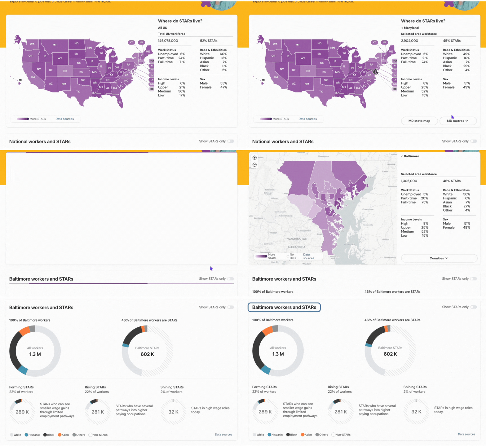
Based on the chosen region on the map, the pie charts on this chart illustrate the ethnic composition of the total workforce and STARs. Additionally, you can explore demographic breakdowns about STARs regarding their career mobility positioning.
Using the Demographic Data Chart
The charts on this page display the ethnic breakdown of the region’s workers defined by the data for the selected area, which could be national-, state-, metro-, or county-based:
- All workers in the region
- All STARs in the region
STARs are further broken into one of three career mobility categories:
- All Forming STARs
- STARs who may have skills for higher-wage jobs but with less significant wage gains and limited occupation pathways.
- All Rising STARs
- STARs who have at least two job pathways offering a higher wage class.
- All Shining STARs
- STARs in higher-wage occupations where they are paid more than two times the median state wage.
Using this chart
Default Overall View shows a collective nationwide data set until a region is selected on the map at the top of the dashboard.

Select a state or metro area on the map to view data for that area in this chart.
Selecting a state or specific PUMA is unlikely to change the data in this chart, as not all PUMAs within a state report enough information.
The title of this chart will update with metro area selections made to clarify what area the data in the chart reflects.

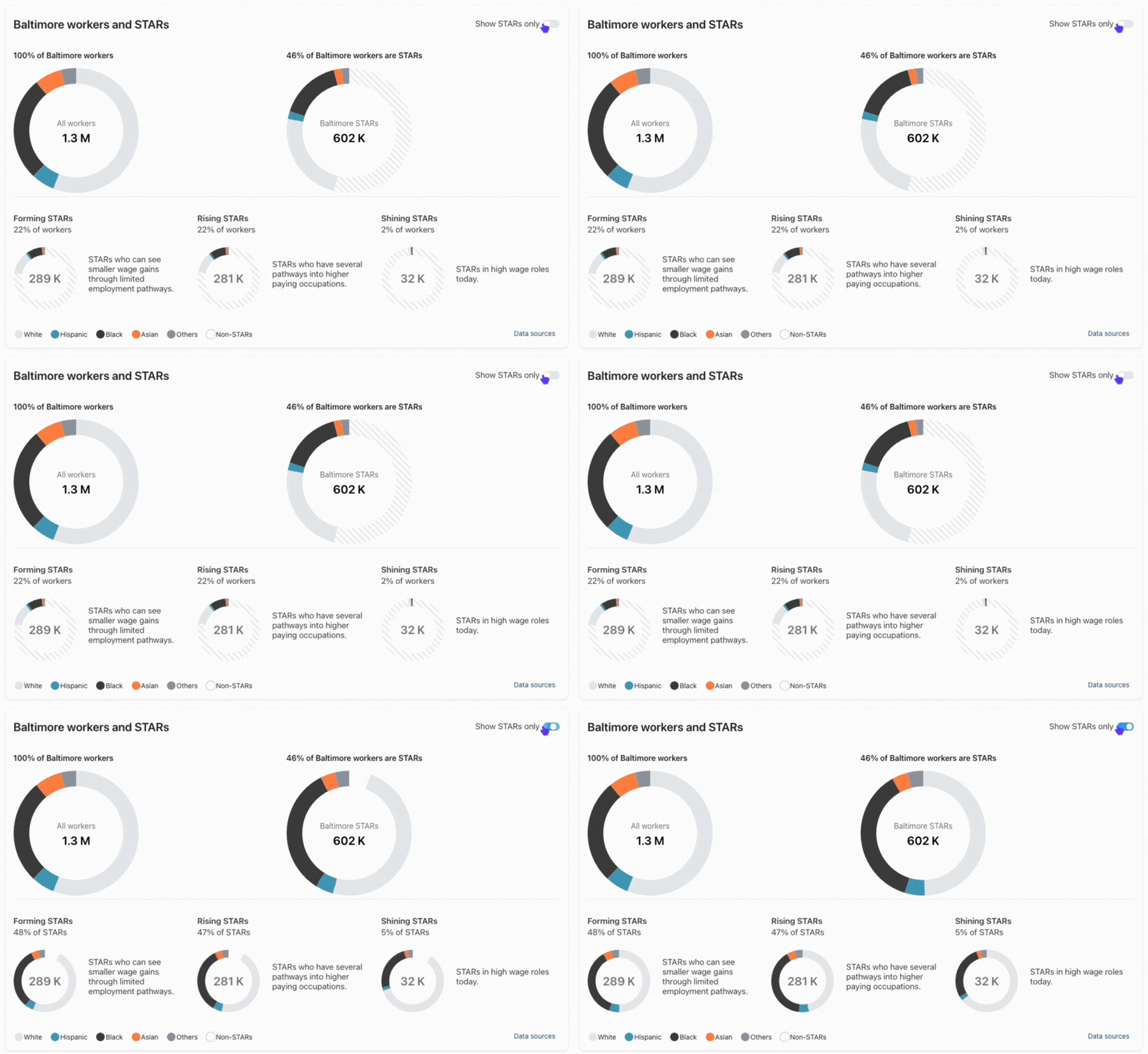
Use the Show STARs Only toggle to omit non-STARs from the applicable circle graphs.
When non-STARs are excluded, the baseline and relative percentages for the circle graphs will represent 100% of STARs in the graph.
The number in the center will not change, as it represents the total for that graph.
With the toggle OFF, the graph starts with:
-
Black workers who are STARs make up 16% of the total workforce.
With the toggle ON, the perspective of the graph becomes:
-
Black workers who are STARs make up 36% of all STARs.

Use the key or hover over a section to interpret what each section in a graph represents.